This entry was posted in Commercials & Advertisements, Brand, campaign, Canada, Fun, marketing, McDonald's, brand identity, brand messaging
Follow the Yellow Brick... Arches? The case for brand consistency
Madalina Zimmerman
June 08, 2018

Madalina Zimmerman
June 08, 2018

When I was younger, our family always went on road trips. I distinctly remember one instance in which we were running low on gas. Severely. We were en route to Dauphin Island, AL to visit my Aunt. It happened to be well into the night. I had just awoken. I needed a bio break (bathroom stop). Perfect timing, since my dad was already planning on stopping for gas. We were out in the middle of nowhere by this point of the drive. Exits were becoming more and more sparse. Thankfully, we approached an exit. The only item on the exit sign was the gasoline character with an arrow pointing down the road that read, .5 miles. Perfect.
Well, not so much.
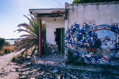
 The .5 miles turned into several, several miles. The gas station turned out to be an abandoned lot homed to an equally abounded and dilapidated house. No gas refill. No bio break.
The rest of the story is fuzzy, which is fine since it doesn't pertain to this blog (but, we did make it to my Aunt's, whew). Point is, you can imagine how peeved my dad was by the inconsistent directions and advertisement of the nearest gas station, especially due to the circumstances. We didn't have the luxury to waste gas.
This anecdote is a peek into the mind of your consumers. Consistency in marketing, like in parenting, is a fundamental building block of your messaging.
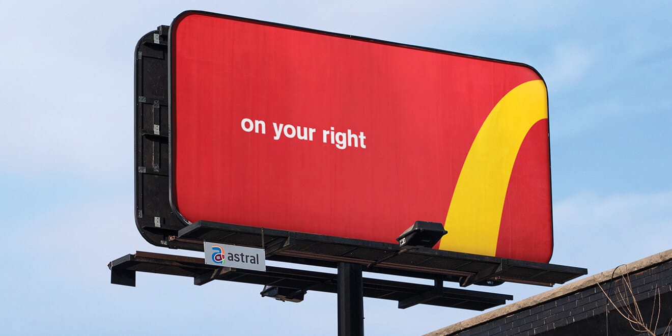
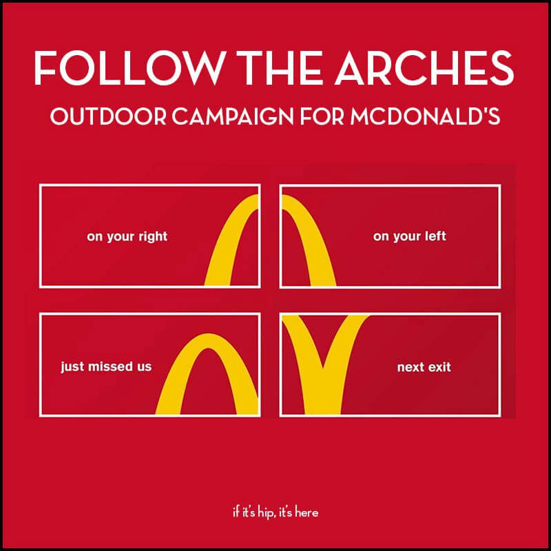
This past winter, McDonald's noticed that its billboard signage and directions to its nearest restaurants throughout Canada were remarkably inconsistent. Recognized this glaring problem within their branding and marketing, they came up with a genius solution. Created by their agency Cossette, they launched the, "Follow the Arches" campaign.
 The launch of the campaign yielded a new way-finding system that was helpful and recognizable. McDonald's realized the arches were a natural looking road sign, and they leaned into that idea. The design was minimal, leaving only what was essential. Each billboard consisted of a cropped portion of the arch paired with simple navigation phrases like, "next exit" or "on your left."
It was clever, easily understandable and consistent. It turned out to be just what their brand needed.
Yes, McDonald's is a worldwide brand. Yes, McDonald's is one of the oldest brands. Yes, McDonald's is one of the most recognizable brands from continent to continent. But, that doesn't mean this case study isn't applicable to any other business.
You could be working for an established, large company or running your own small business. Regardless, one of the worst things for a business and its brand is inconsistent branding and advertisement. Like, the existing, non-existent gas station (see above if you have already forgotten). For McDonald's, it was an unnecessary and avoidable loss. But with a little branding and a lot of ingenuity, they were able to turn a negative experience, into a great brand moment!
Is your messaging consistent? Reach out and let us know below!
This entry was posted in Commercials & Advertisements, Brand, campaign, Canada, Fun, marketing, McDonald's, brand identity, brand messaging