Each year, there is waiting anticipation as to what the Starbucks holiday cup design will be. Throughout the years, Starbucks has masterfully created a successful “Christmas brand” around the holiday seasons, but like any brand, they have had their share of success and failure. And though, they have faced failure, they are a prime case study when it comes to listening to its consumers and redirecting course in a proactive and successful manner.
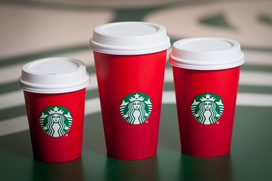 Though Starbucks has had many many years of their holiday cups, I’d like to only go back a couple years. In 2015, I was a Sophomore in college, working at a Starbucks. I remember vividly receiving the Christmas packages of all the cups. At first, I wasn’t sure how I thought about them. Too simple was my immediate reaction. But, over time, I found myself liking the minimal, sleek, bright matte ombre red cup. However, not everyone warmed up to the simple design, posting to twitter stating the cups were a “War on Christmas.”
The design was so offensive to individuals that they publicly announced their boycotting of Starbucks.
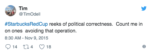
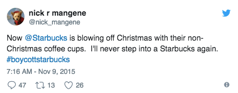
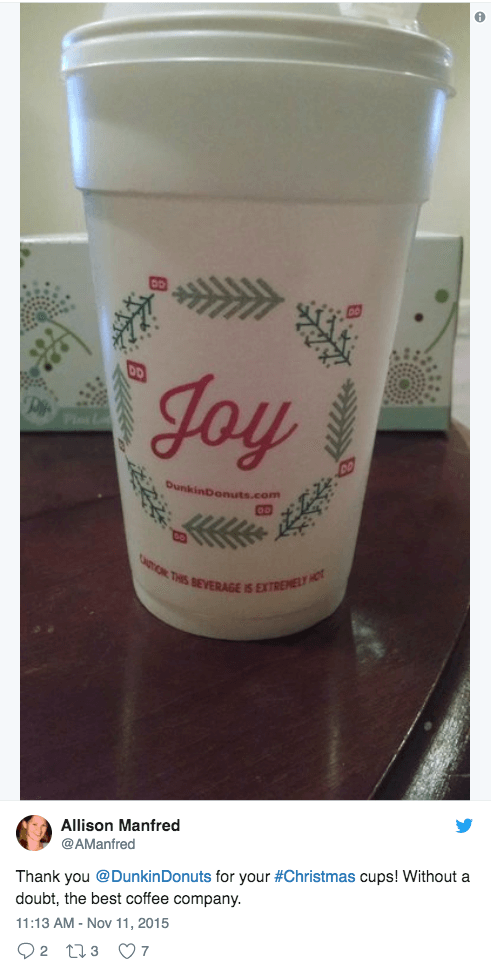
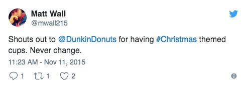
And with the release of Dunkin’ Donuts unofficial holiday cup at the time, it only added fuel to the fire.
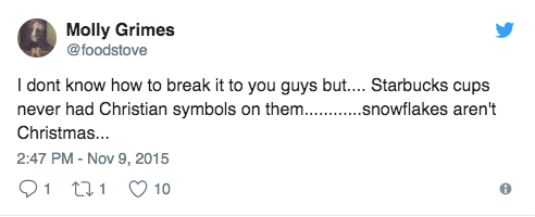
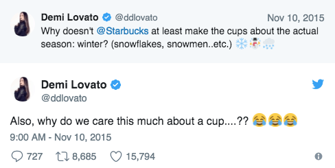
By this point, a third party chimed into the online conversation, kick starting the hashtag #ItsJustACup.
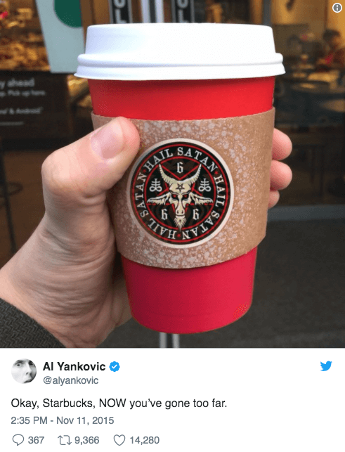
And then of course, there were others who happily mocked the conversation.
Who would have thought a red cup would have been so controversial? Starbucks sure didn’t. In fact, the design of the cup was intended to be a blank canvas for its costumers to doodle on. Something that Starbucks noticed its costumers doing on the standard white cups. Instead of creating a holiday design, Starbucks intention was to allow its consumers to tell a story through their own design. A statement released by the Vice President of Design & Content of Starbuck, Jeffrey Fields mentioned, "In the past, we have told stories with our holiday cups designs...This year we wanted to usher in the holidays with a purity of design that welcomes all of our stories."
The 2015 cup faced unforeseen criticism, but that did not discourage Starbucks to proceed with the release of the 2016 cups. Since their intentions of the 2015 cup were not effectively communicated to the public, they adapted slightly, and produced, in my opinion, their best cups yet.
The 2016 holiday cups were an amalgamation of wintery, Christmas imagery sketched by consumers world-wide. Starbucks had asked for submissions and would pull their favorites. Thousands of submissions were submitted and eventually 12 designs were picked and printed on the cups. 2016’s cups were the epitome of ushering the, “ holidays with a purity of design that welcomes all of our stories."
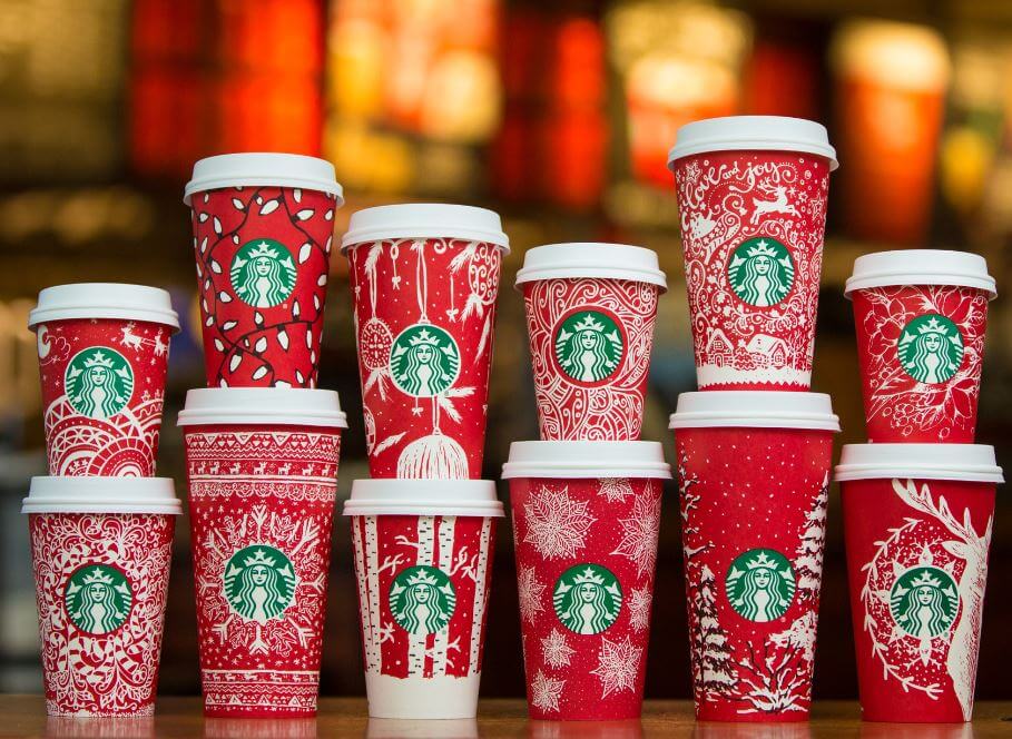
Starbucks could have pointed fingers in the failure of the 2015 cups, they could have tweeted back at the trolls and picked online fights with other corporations whom were mocking the error. They could have released no cup the following year. Instead, they took the criticism and re-evaluated, creating a successful and unforgettable Christmas marketing camping for the 2016 cups.