“How’s that project coming along?”
“I think the last time we worked on it, we got the music done.”
“I don’t think we got the music done.”
“Really? This tattered post-it note with a hundred other things scribbled on it says we did.”
“There’s no music in the video.”
“Oh...wait, I guess this does say ‘DO MUSIC’ not...ugh. THERE MUST BE A BETTER WAY!”
<cue infomercial music>
Scheduling and keeping track of your Post-Production work can be tricky when you start taking on more and more projects. A multitude of delivery dates, different stages of edit, waiting on graphics, waiting on music, has the color been done, has the client even seen this? It can be a whirlwind.
In an ideal world, editors such as myself could concentrate on only a single project at a time from start to finish. Do your rough, get client approval, do final color and audio, render and deliver. Boom. Done. Easy. But that’s not how it actually works and we all know it.
I found myself losing track of where a particular project was in it’s edit, especially those being worked on by another editor. The post-it notes of “things I still need to finish” had started to overtake my monitor and the small 2’x3’ dry erase board that we doodled on with progress statuses was just not helpful.
I realized I needed a bigger, better, cleaner, and more organized way to showcase all the projects we were working on and where things were. Enter HOME DEPOT.
The Idea
I wanted to develop a large grid system, something visual that at a glance you could see exactly where a project was in a series of steps that I had developed over the years (more on these in a moment). It also needed to be large enough to accommodate the on average 50 videos we were working on at any given time.
My first thought was going digital with the organization, however that hit a snag. Not only would this new organization system be for us, it would also be helpful for the other employees in the company to see where things were with any project. I didn’t want to rely on a website that people would have to log into and view, nor did I want a TV screen on in the edit suite constantly displaying a spreadsheet. So suffice to say this idea was scrapped quickly.
Finally it came down to needing a big, dry erase board that could be broken down into a custom grid and organized the best way for our needs. Now, I’m not sure if you’ve ever looked at the cost of dry erase boards but oooh brother they are not cheap, and for the size we needed we’d be spending thousands of dollars easily.
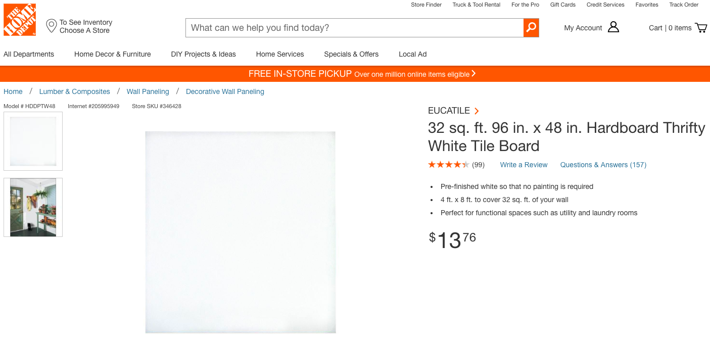
That’s when I found an article about people making dry erase walls (much like you’d make a chalkboard wall in your house) which led me to a particular writer talking about using “Hardboard White Tile Board” from Home Depot or Lowes. This material is designed for walls in the kitchen or laundry room, has a glossy or matte white surface, and is made to easily wipe off of scuffs, marks, or dirt. And the best part it comes in an 8’x4’ sheet for $13.76.
I’ll say that again: it comes in an 8’x4’ sheet for $13.76.

It is LITERALLY the perfect thing for us. And did I mention how cheap it was?
Set Up & Layout
So needless to say, we bought a sheet of it and cut it down to a 6’x4’ to make it more manageable, and mounted it onto the wall using a series of screws every foot or so around the edge.
Now came the tricky part, how was this going to be organized? Our post-production process usually follows a similar series of steps: Assembly, Rough, Internal Review, Client Approval, Fine, Client Approval, Color, Graphics, Music, Audio, Final Render, Delivered.
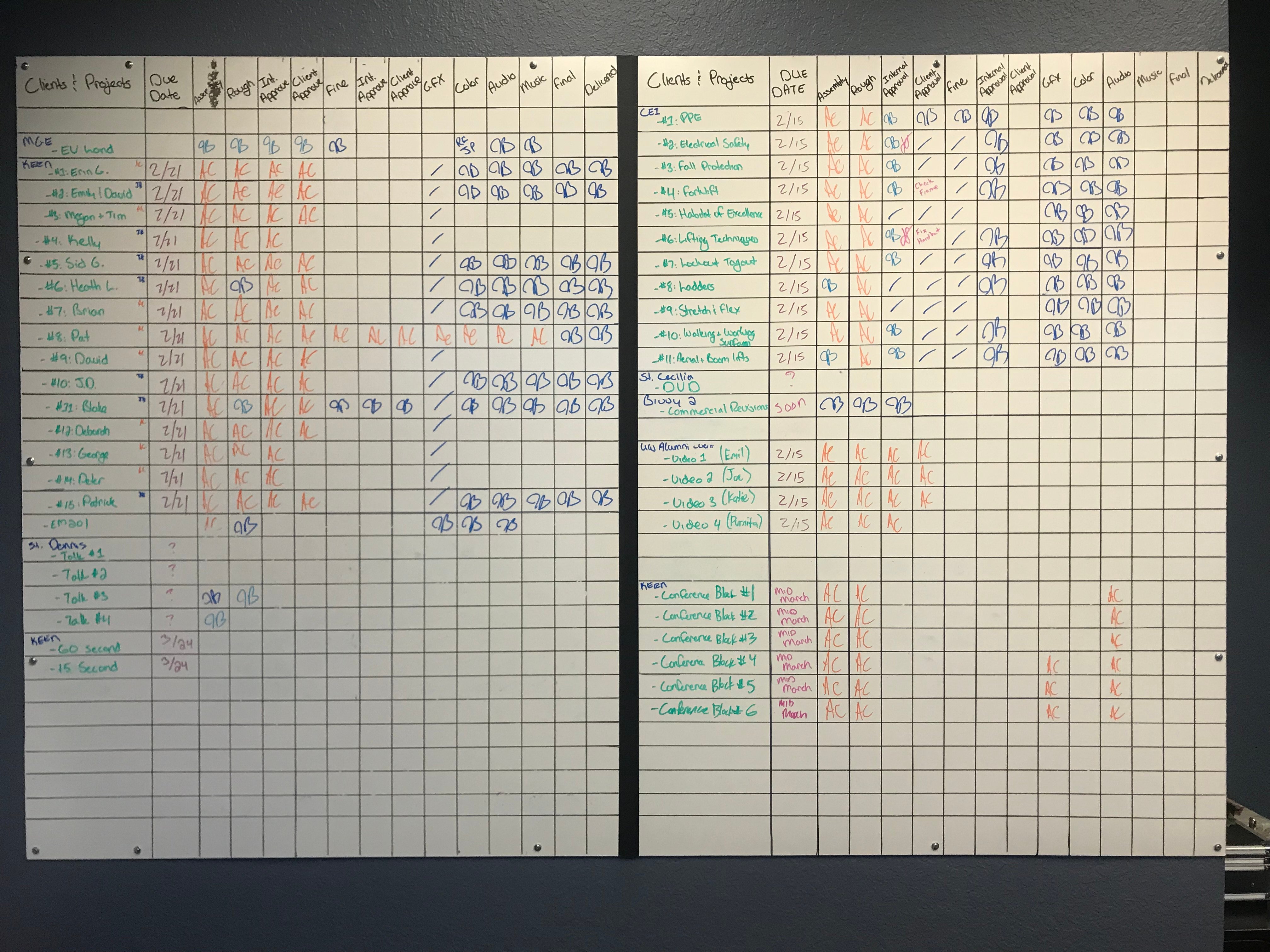
After a handful of small tests in Photoshop, countless measuring and re-measuring, we ended up coming up with this:

And it’s worked perfectly. I know it might look a little overwhelming at first but it’s actually pretty simple. We divided it into two halves to give us the most amount of individual deliverable videos as possible, so the right side is simply a duplicate of the left.
The columns include all of our personal production steps as well as a space for the Client name and project title and due date. The “Delivered” column while it might seem to be unnecessary, is helpful for larger quantity projects that certain videos might have been finalized and sent to the client while others are still being worked on. (No sense delivering the same file twice).
The boxes for each section can be signed off by the editor’s initials so those outside the post-production room know who worked on any given step.
And finally, the best part of this board is the moment when you get to erase a line or a section because the entire project is delivered. That moment is one of the happiest in the room, even with the looming thought that it’s going to fill right back up again next week with another 15 videos for a new client.
Final Thoughts
This concept is exactly what we need, however I’m aware it might be too much for some people. Others rely very heavily on technology to achieve the same thing. A Google Spreadsheet could be made to show the exact same thing without the need of buying materials, however I’m a physical type of guy that likes something written down or showing in front of me.
Looking over at the board as I type this post, I can see the progress being made on long term projects. It gives me a sense of renewed energy that there is an end in sight, that despite the amount of deliverables, all in their various stages of work, we’re going to get there soon, one column at a time.
This entry was posted in post production, editing, video

